
The other night I stopped at a place called snowmounteen so a friend could grab a drink and I was extremely impressed with the design of the place. It had lots of white walls and soft light, paired with warm wood and funky furniture.
Of course I grabbed a menu/brochure to take with me so that I could share the awesome design with everyone else.

I love how clean and the simple the cover design is. Snowmounteen serves a lot of cold desserts and shakes so the colors are a perfect fit.
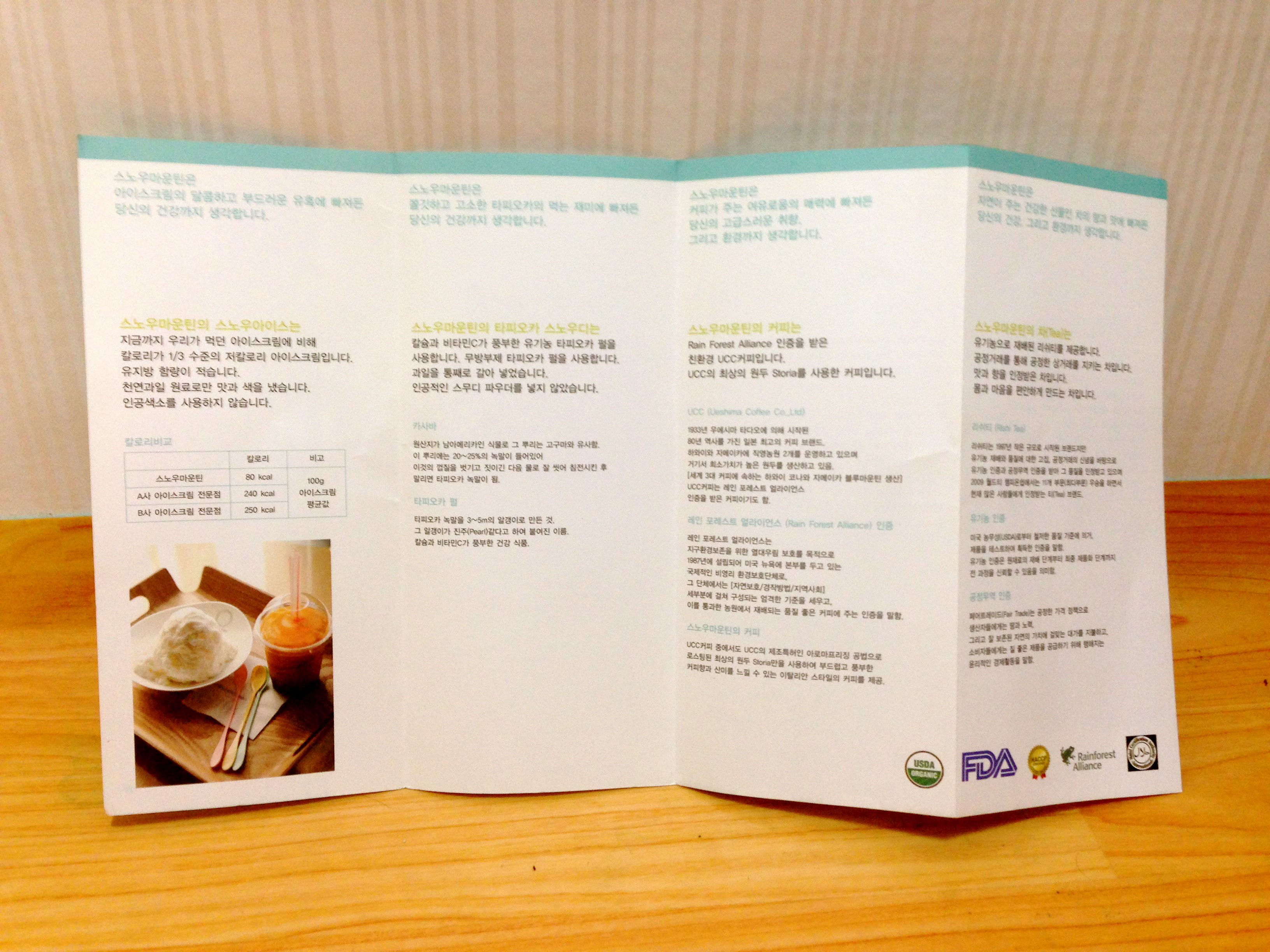
There is a clear use of a grid on the inside for the menu, as well as lots of whitespace which I love!

There are also pictures included of the interior which I mentioned earlier- beautiful.
The website is pretty awesome too.


The homepage has a cool grid that rotates different images and is very atheistically pleasing. It’s also very easy to navigate. The grid design is continued in the menu section, plus some more whitespace along with nice photography.

Even the logo is awesome!
